Design Principles
Covers the fundamental principles of accessible design—perceivable, operable, understandable, and robust—to ensure content is accessible to everyone. It also guides on choosing accessible color contrasts and typography for better readability and tips on responsive design to maintain accessibility across different devices and screen sizes.
Accessibility Design Basics
Accessible design focuses on ensuring that digital environments are usable by everyone, including people with disabilities. The core principles, as defined by the Web Content Accessibility Guidelines (WCAG), require that content be perceivable, operable, understandable, and robust:
Perceivable
Information must be presented in ways that all users can discern, regardless of their sensory abilities. This means providing text alternatives for non-text content, creating content that can be presented in different ways (such as simpler layout) without losing information, and ensuring that users can see and hear content.
Operable
User interface components and navigation must be operable by all users. This includes making all functionality available from a keyboard if needed, giving users enough time to read and use content, not designing content in a way that is known to cause seizures, and providing ways to help users navigate, find content, and determine where they are.
Understandable
Information and the operation of the user interface must be understandable. This means making text content readable and predictable, providing input assistance to help users avoid and correct mistakes, and ensuring that web pages appear and operate in predictable ways.
Robust
Content must be robust enough to be interpreted reliably by a wide variety of user agents, including assistive technologies. This means ensuring compatibility with current and future user tools.
Color Contrast and Typography
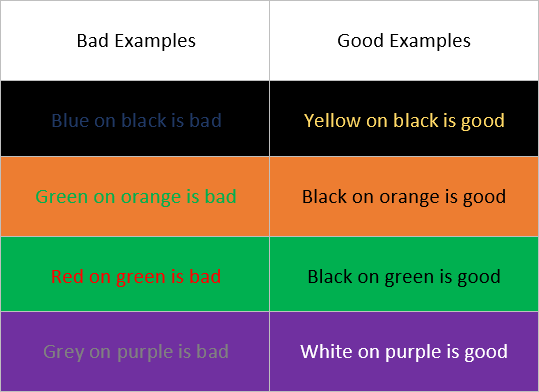
Good color contrast and typography are essential for making content accessible. Visually-impaired users, including those with color blindness, rely on sufficient contrast between text and its background to read comfortably.
Color Contrast
WCAG guidelines recommend a contrast ratio of at least 4.5:1 for normal text and 3:1 for large text. Tools like the WebAIM Color Contrast Checker can help designers ensure that their color selections meet these criteria.

Typography
Choosing the right fonts can significantly improve readability. Fonts should be clear and easy to read, and the use of adjustable text sizes should be supported to accommodate users with visual impairments. Avoid using fonts that are overly decorative and ensure line spacing and paragraph spacing are adequate to prevent text from being cramped.
https://www.csun.edu/universal-design-center/web-accessibility-criteria-color-contrast

https://fonts.google.com/knowledge/readability_and_accessibility/introducing_accessibility_in_typography
Responsive Design
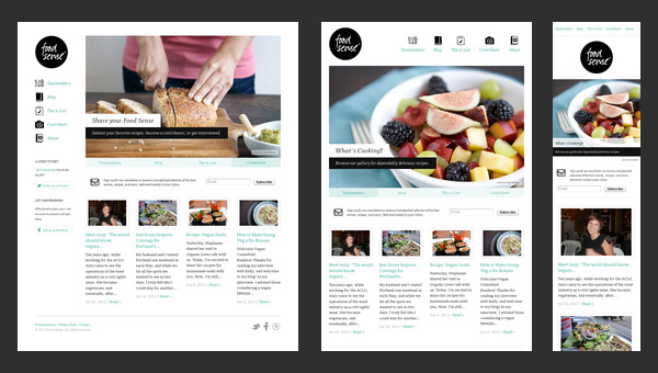
Responsive design is critical in ensuring that websites are accessible on all devices, from desktop computers to smartphones and tablets. This approach involves designing sites with flexible layouts that adapt to the size of the device’s screen.
Flexible Layouts
Use CSS flexbox and grid layouts that allow content to resize and reorganize dynamically depending on the screen size.
Media Queries
CSS media queries can be used to apply different styling rules based on the characteristics of the device the website is being viewed on, such as its width, height, orientation, and resolution.
Touch Targets
Ensure that interactive elements like buttons and links are large enough to be tapped easily on a touchscreen device. The recommended minimum size for touch targets is 44×44 pixels.
Testing on Multiple Devices
Regularly test your website’s accessibility on various devices to ensure that all users have a consistent and accessible experience, regardless of how they access the site.

